In print, colour isn’t decoration – it’s communication.
Before a customer reads a word or touches the paper, colour has already done its job. Or failed it.
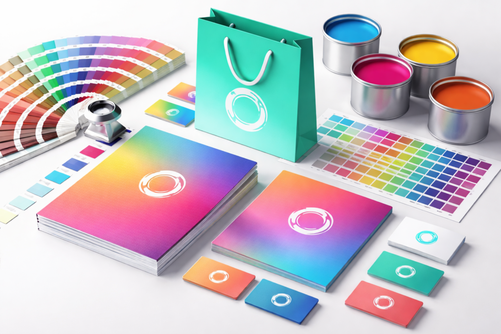
Small shifts in tone, saturation, or balance might seem insignificant in production, but in the real world, they shape how a brand is perceived – instantly and subconsciously.
Small Shifts, Big Impressions
The human eye is incredibly sensitive to inconsistency.
A red that prints slightly duller than expected.
A blue that leans a touch too warm.
A gradient that loses depth.
Individually, these shifts feel minor. Collectively, they change the message.
Colour signals quality, confidence, and control. When it’s off – even subtly – the brand can feel cheaper, rushed, or less trustworthy. Customers may not articulate what’s wrong, but they notice it.
Consistency across brochures, packaging, signage, and marketing collateral reinforces recognition. When colour drifts, that recognition weakens.
Why “Close Enough” Isn’t Neutral
“Close enough” is never neutral – it always leans somewhere.
And often, it leans away from trust.
Inconsistent colour suggests inconsistency elsewhere. If the print feels uncontrolled, customers subconsciously question the product, the service, or the promise behind it.
Brands invest heavily in identity systems, Pantones, and guidelines for a reason. Colour accuracy isn’t about perfectionism – it’s about alignment. Every touchpoint should say the same thing, visually and emotionally.
How Accuracy Supports Brand Trust
Trust is built through repetition.
When colour is accurate and consistent:
-
Marketing feels deliberate
-
Packaging feels premium
-
Collateral feels reliable
Customers don’t have to think about the brand – they simply recognise it and feel comfortable engaging with it.
Accurate colour also reduces friction internally. Teams don’t waste time reprinting, second-guessing, or explaining inconsistencies. What’s approved is what’s received.
That reliability compounds over time, turning visual consistency into brand confidence.
Precision Is a Strategic Choice
Colour accuracy isn’t a technical detail – it’s a strategic decision.
It tells customers that the brand cares about the details, controls its processes, and values consistency.
At scale, those details are what separate brands that feel established from those that feel uncertain.
Because in print, perception isn’t optional – it’s inevitable.